ESC
On this page
Components > Animated Tabs
page.tsx
1import { AnimatedTabs } from "@/components/app-components";Switch between different sections seamlessly with our animated tab component! 🔄 The active tab transforms with a smooth, playful animation, making navigation a breeze. Say goodbye to static tabs and hello to a dynamic, user-friendly experience! 🌟
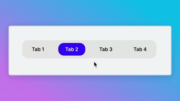
Dive into the example below to witness how effortlessly you can incorporate this functionality into your projects:
components/sampleComponent.tsx
1
2  const options: Option[] = [
3    {
4      label: "Tab 1",
5      value: "tab-1",
6    },
7    {
8      label: "Tab 2",
9      value: "tab-2",
10    },
11    {
12      label: "Tab 3",
13      value: "tab-3",
14    },
15    {
16      label: "Tab 4",
17      value: "tab-4",
18    },
19  ];
20
21  const SampleComponent = () => {
22    const [selectedOption, setSelectedOption] = useState<Option>({
23      label: "Tab 1",
24      value: "tab-1",
25    });
26
27    return (
28      <>
29        ...
30        <AnimatedTabs
31          options={options}
32          selectedOption={selectedOption}
33          setSelectedOption={setSelectedOption}
34        />
35        ...
36      </>
37    );
38  };
39
All the props of the component is typed by Typescript. So you are safe 🙂